---
title: "Charts"
description: "Define one terminal chart that adapts from portable Unicode cells to smooth terminal graphics."
image: "https://tuika.dev/social-card.png"
---
> Documentation Index
> Fetch the complete documentation index at: https://tuika.dev/llms.txt
> Use this file to discover all available pages before exploring further.
# Charts
[`tuika-charts`](https://crates.io/crates/tuika-charts) defines one chart model
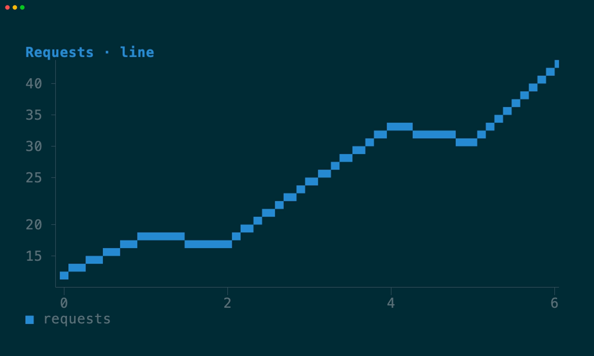
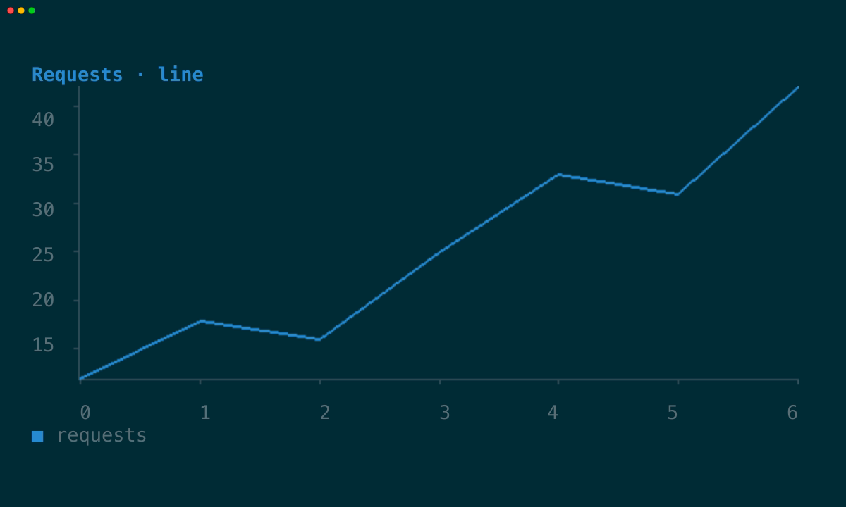
for two terminal rendering paths. A graphics-capable terminal gets a smooth RGBA
plot; every other terminal gets a dense Unicode plot. Applications do not keep
two chart implementations or ask users to choose a mode.
| Portable cells | Terminal graphics |
| --- | --- |
|  |
|  |
## Adaptive by default
`Chart` is a normal `View`. When an application runs through tuika's `Runner`,
the framework detects the terminal and owns the image lifecycle:
- Kitty, Ghostty, and WezTerm receive raw RGBA through the Kitty graphics
protocol.
- iTerm2 receives a PNG through its inline-image protocol.
- a Sixel-capable custom host can select Sixel explicitly.
- all other environments render directly into terminal cells.
The selection changes fidelity, not meaning. Both paths share the same title,
legend, axis tick labels, series, colors, numeric domains, clipping, empty
state, and handling of non-finite points. The graphics plot is an image, while
its title, legend, and tick labels remain cells for crisp, consistent text.
```rust
let chart = Chart::new()
.title("Requests")
.series(Series::line("api", points));
// Return `chart` from Application::view. Runner supplies graphics when the
// terminal supports them and otherwise leaves Chart on its cell path.
Runner::new(RunnerConfig::default())
.run(&Theme::default(), &mut app)?;
```
Direct calls to `paint` use cells by default, making in-memory tests stable.
Custom terminal hosts can supply `ImageSupport` and `ImageLayer` through
`RenderCtx::with_image_graphics`, then emit and clear that layer after each cell
frame.
## Series gallery
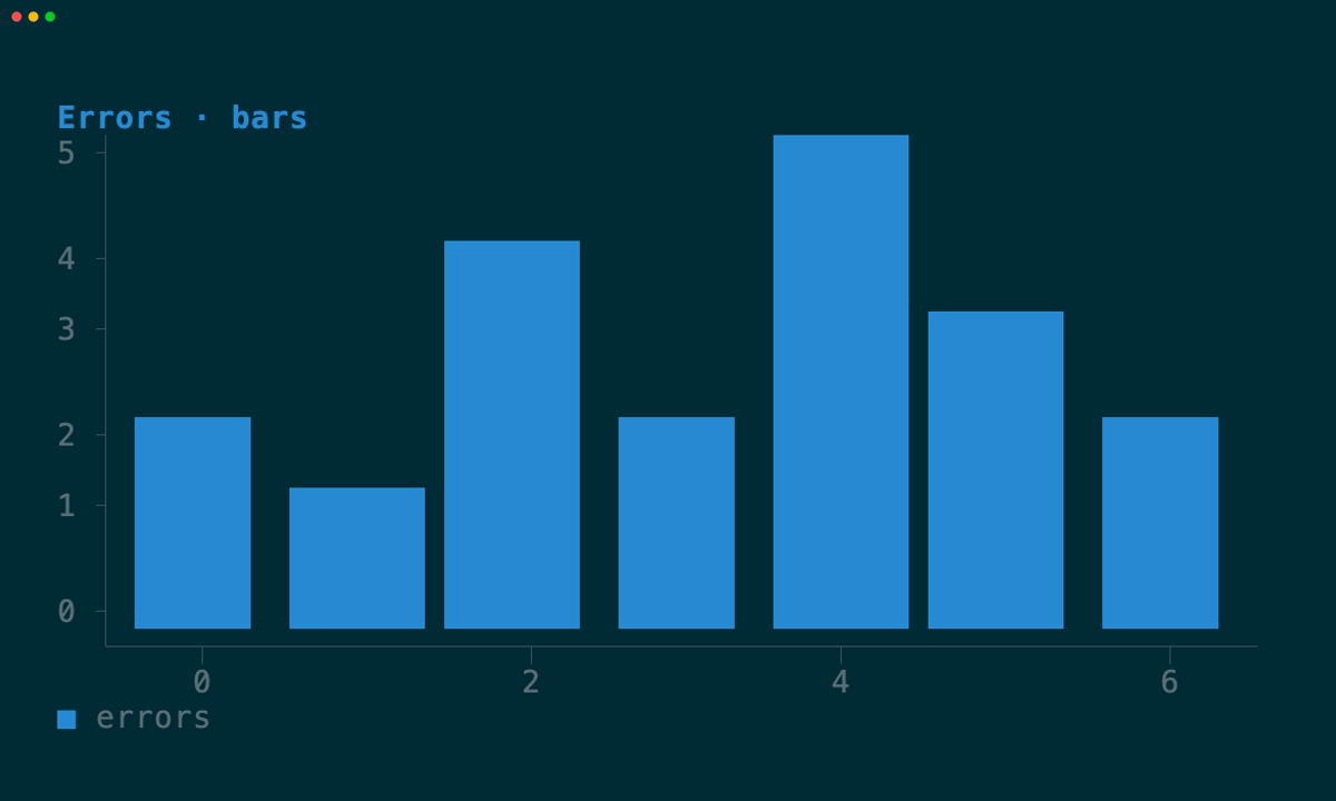
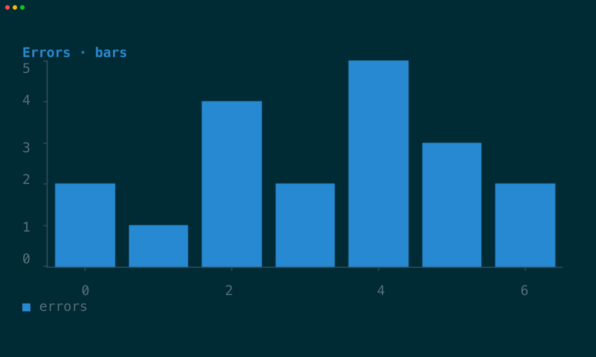
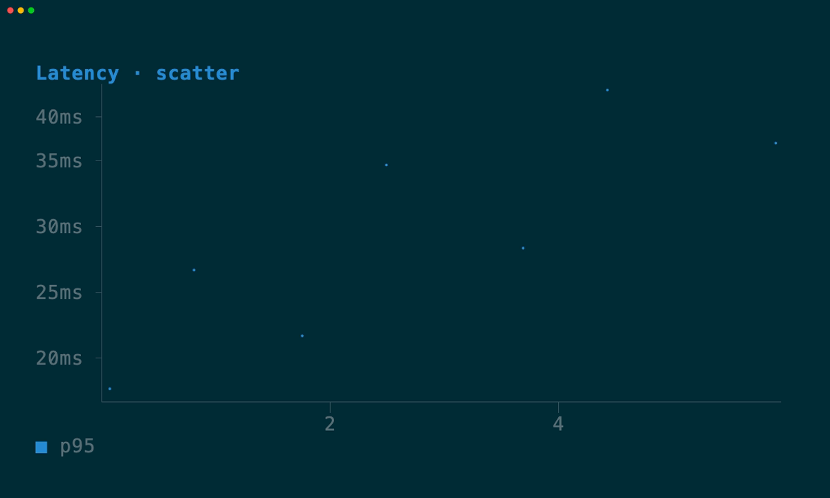
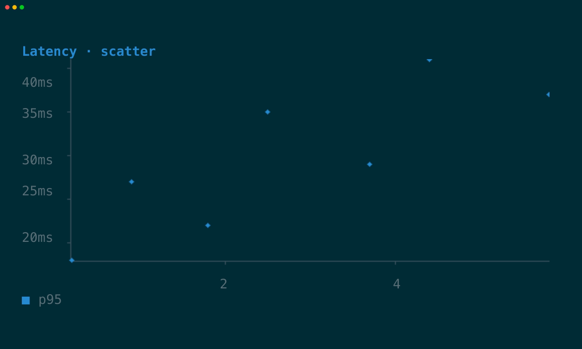
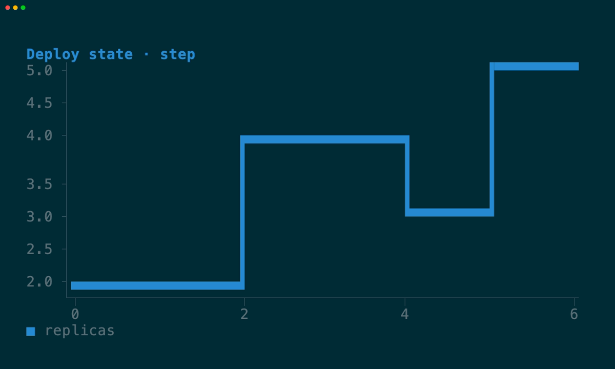
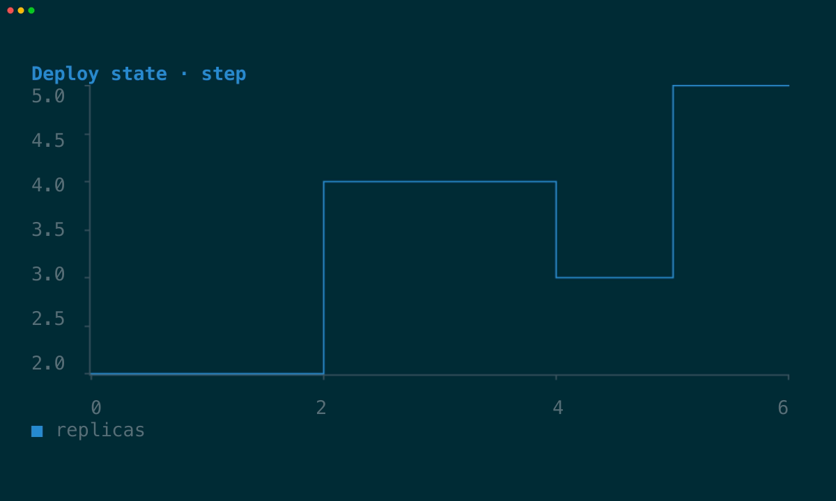
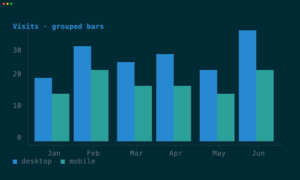
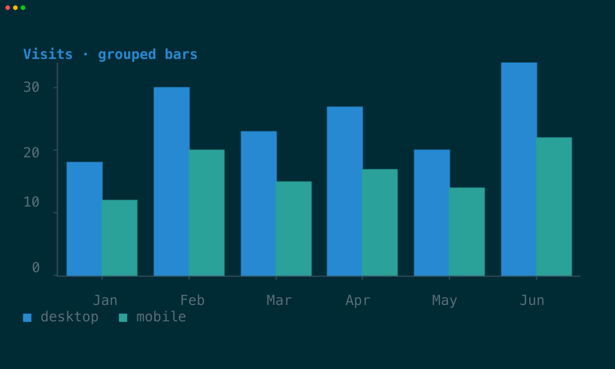
Every pair below is generated from the same runnable example at the same size.
The left capture disables graphics signals; the right capture runs through
Ghostty and exercises the actual Kitty image output.
### Line
Use a line for connected samples and trends.
| Cells | Graphics |
| --- | --- |
| | |
### Area
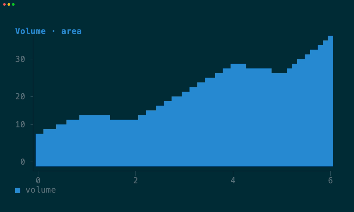
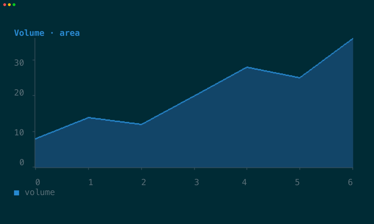
An area connects samples and fills the space down to the plot baseline. The
cell renderer shares one quadrant boundary between edge and fill, preventing
gaps or fill above the line; graphics mode can keep a bright edge over a dimmer
fill.
| Cells | Graphics |
| --- | --- |
|
|
## Adaptive by default
`Chart` is a normal `View`. When an application runs through tuika's `Runner`,
the framework detects the terminal and owns the image lifecycle:
- Kitty, Ghostty, and WezTerm receive raw RGBA through the Kitty graphics
protocol.
- iTerm2 receives a PNG through its inline-image protocol.
- a Sixel-capable custom host can select Sixel explicitly.
- all other environments render directly into terminal cells.
The selection changes fidelity, not meaning. Both paths share the same title,
legend, axis tick labels, series, colors, numeric domains, clipping, empty
state, and handling of non-finite points. The graphics plot is an image, while
its title, legend, and tick labels remain cells for crisp, consistent text.
```rust
let chart = Chart::new()
.title("Requests")
.series(Series::line("api", points));
// Return `chart` from Application::view. Runner supplies graphics when the
// terminal supports them and otherwise leaves Chart on its cell path.
Runner::new(RunnerConfig::default())
.run(&Theme::default(), &mut app)?;
```
Direct calls to `paint` use cells by default, making in-memory tests stable.
Custom terminal hosts can supply `ImageSupport` and `ImageLayer` through
`RenderCtx::with_image_graphics`, then emit and clear that layer after each cell
frame.
## Series gallery
Every pair below is generated from the same runnable example at the same size.
The left capture disables graphics signals; the right capture runs through
Ghostty and exercises the actual Kitty image output.
### Line
Use a line for connected samples and trends.
| Cells | Graphics |
| --- | --- |
| | |
### Area
An area connects samples and fills the space down to the plot baseline. The
cell renderer shares one quadrant boundary between edge and fill, preventing
gaps or fill above the line; graphics mode can keep a bright edge over a dimmer
fill.
| Cells | Graphics |
| --- | --- |
|  |
|  |
### Bar
Bars are vertical marks centered on numeric x coordinates. Automatic x domains
reserve half a bar interval beyond the first and last values so edge bars remain
inside the plot.
| Cells | Graphics |
| --- | --- |
|
|
### Bar
Bars are vertical marks centered on numeric x coordinates. Automatic x domains
reserve half a bar interval beyond the first and last values so edge bars remain
inside the plot.
| Cells | Graphics |
| --- | --- |
|  |
|  |
### Scatter
Scatter series keep samples independent. The portable path uses Braille's 2×4
subcell grid; graphics mode uses pixel marks.
| Cells | Graphics |
| --- | --- |
|
|
### Scatter
Scatter series keep samples independent. The portable path uses Braille's 2×4
subcell grid; graphics mode uses pixel marks.
| Cells | Graphics |
| --- | --- |
|  |
|  |
### Step
Step series draw horizontal-then-vertical transitions, useful for replicas,
states, thresholds, and other values held until the next sample.
| Cells | Graphics |
| --- | --- |
|
|
### Step
Step series draw horizontal-then-vertical transitions, useful for replicas,
states, thresholds, and other values held until the next sample.
| Cells | Graphics |
| --- | --- |
|  |
|  |
### Grouped bars
Several bar series share a category band, each taking a slot inside it with a
gutter between neighbouring groups.
| Cells | Graphics |
| --- | --- |
|
|
### Grouped bars
Several bar series share a category band, each taking a slot inside it with a
gutter between neighbouring groups.
| Cells | Graphics |
| --- | --- |
|  |
|  |
### Stacked
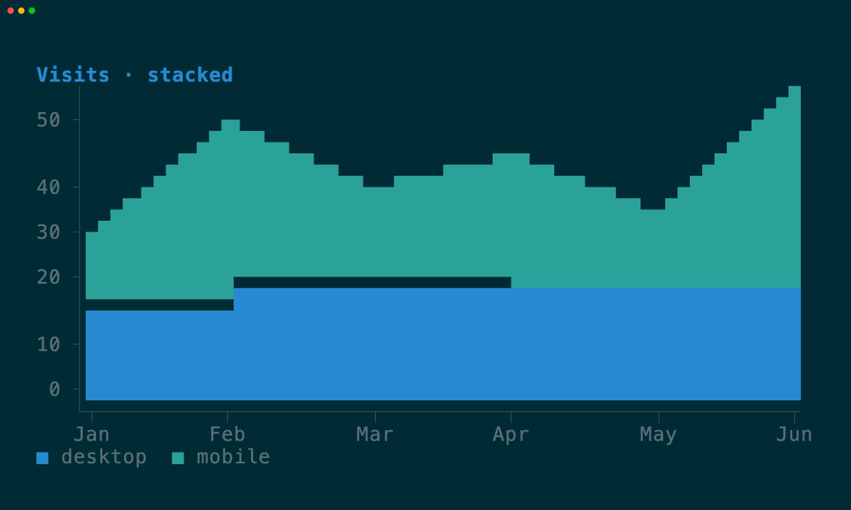
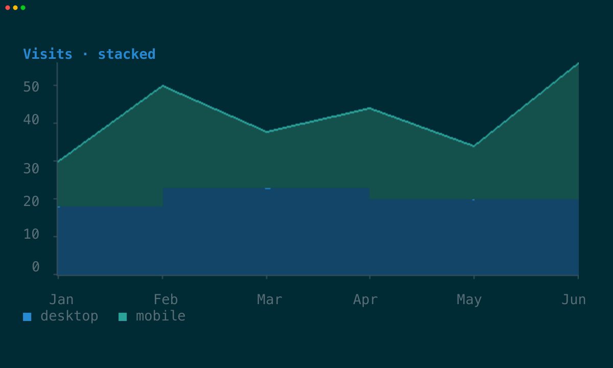
`Chart::stack` sums bar or area series at each position, each starting where the
one below it ended.
| Cells | Graphics |
| --- | --- |
|
|
### Stacked
`Chart::stack` sums bar or area series at each position, each starting where the
one below it ended.
| Cells | Graphics |
| --- | --- |
|  |
|  |
### Horizontal
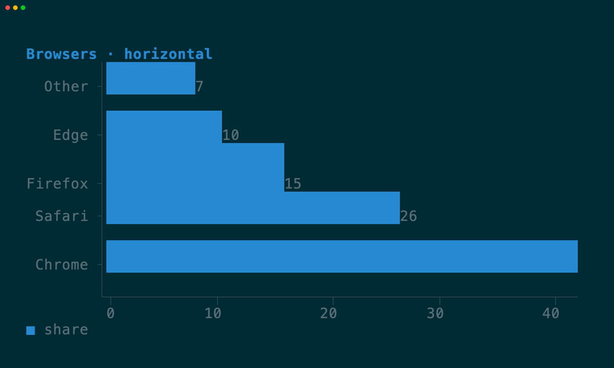
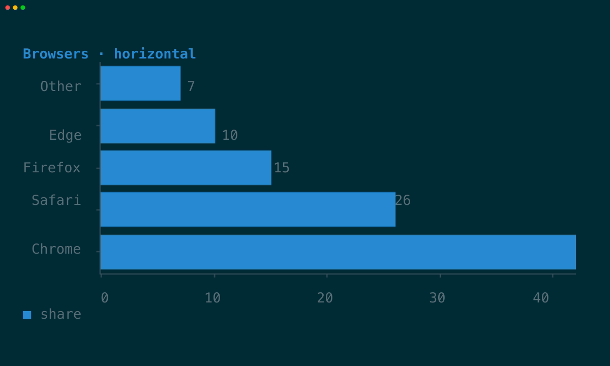
`Chart::horizontal` puts categories down the side, where a name gets a whole row
of width instead of one column.
| Cells | Graphics |
| --- | --- |
|
|
### Horizontal
`Chart::horizontal` puts categories down the side, where a name gets a whole row
of width instead of one column.
| Cells | Graphics |
| --- | --- |
|  |
|  |
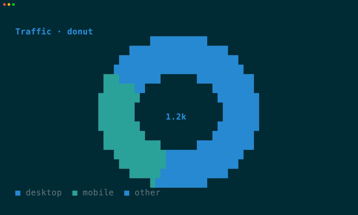
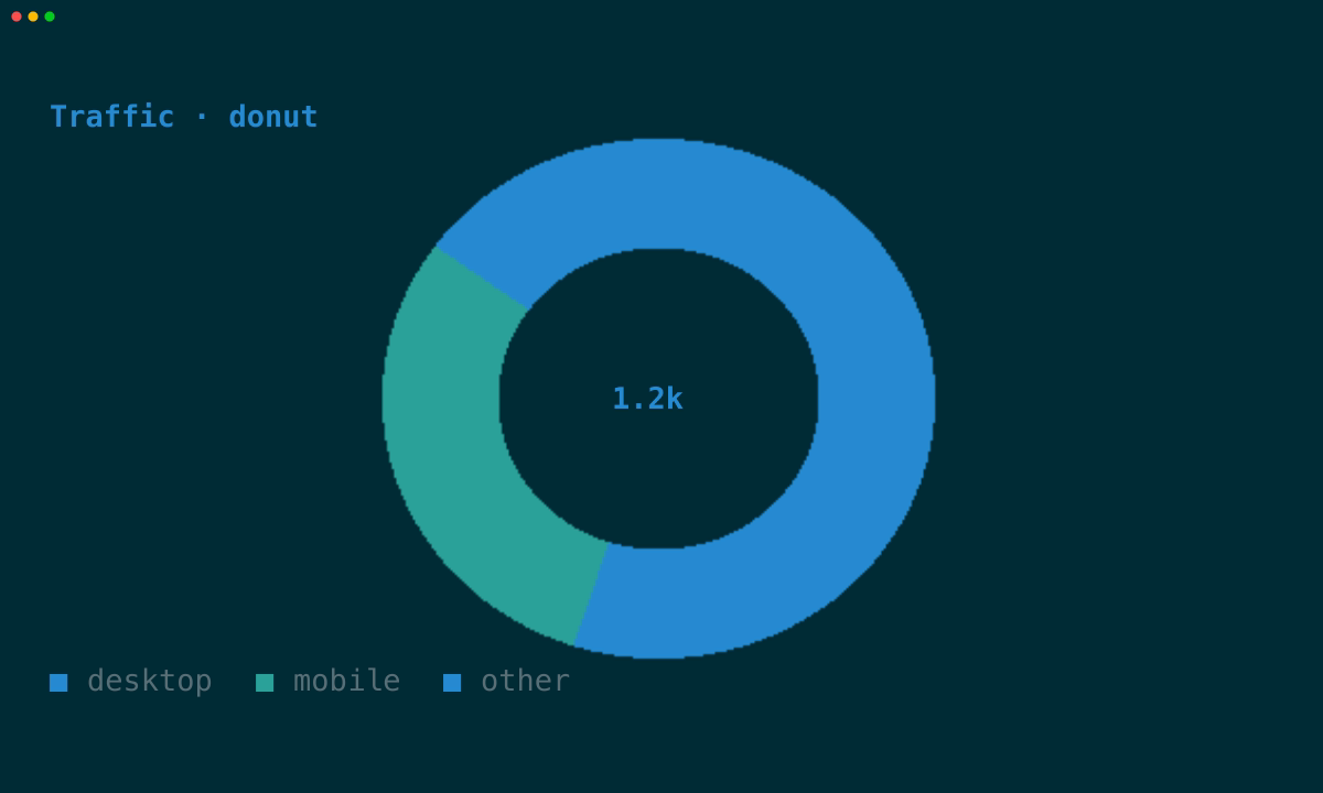
### Donut
A ring with optional centre text — the one polar shape that stays readable in
cells. Slices are named by the legend rather than by radial labels.
| Cells | Graphics |
| --- | --- |
|
|
### Donut
A ring with optional centre text — the one polar shape that stays readable in
cells. Slices are named by the legend rather than by radial labels.
| Cells | Graphics |
| --- | --- |
|  |
|  |
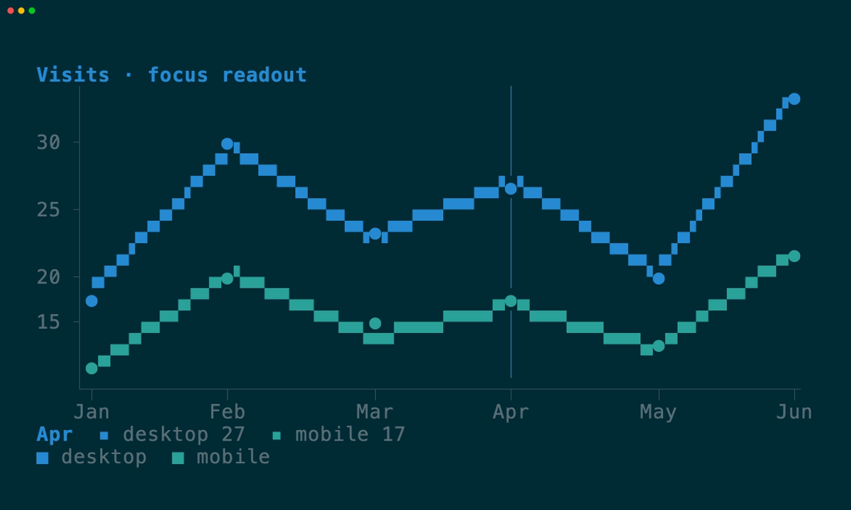
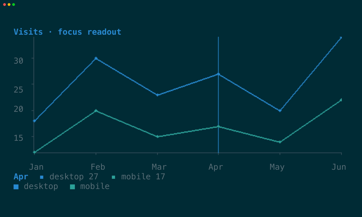
### Focus readout
`Chart::focus` marks one position with a rule and lists every series' value
there — the terminal's answer to a hover tooltip.
| Cells | Graphics |
| --- | --- |
|
|
### Focus readout
`Chart::focus` marks one position with a rule and lists every series' value
there — the terminal's answer to a hover tooltip.
| Cells | Graphics |
| --- | --- |
|  |
|  |
## Axes
Both axes carry tick labels by default. Ticks land on round values — a power of
ten times 1, 2, 2.5, or 5 — so a reader gets numbers they recognize rather than
the raw division of the domain, and the label precision follows the step: a step
of `0.25` prints two decimals, a step of `20` prints none.
```rust
use tuika_charts::{Axis, Chart};
let chart = Chart::new()
// Aim for four intervals and label them in milliseconds.
.y_axis(Axis::new().ticks(4).format(|value| format!("{value:.0}ms")))
// Give the label row back to the plot.
.x_axis(Axis::hidden());
```
Labels never crowd out the chart they describe. The y labels claim a gutter left
of the axis, and are dropped entirely rather than take more than half the width;
x labels use the margin row the plot already reserved, so labelling that axis
costs no plot height at all. Where x labels would collide, they are thinned left
to right — a narrow chart shows fewer labels, never overlapping ones.
Both renderers draw tick labels as cells, because the graphics image covers the
plot only. The same numbers therefore appear in the same places in both modes.
### Categories
Most bar and area charts are not measuring a numeric x axis, they are naming
positions. `Axis::categories` does that: series carry `Point::new(index, value)`
and the axis names each index.
```rust
use tuika_charts::{Axis, Chart, Point, Series};
let chart = Chart::new()
.x_axis(Axis::new().categories(["Jan", "Feb", "Mar"]))
.series(Series::bar("desktop", [
Point::new(0.0, 18.0),
Point::new(1.0, 30.0),
Point::new(2.0, 23.0),
]));
```
Ticks then land on every category instead of on round numbers, and thinning
drops whole names rather than truncating them — half a month is not a shorter
month.
## Stacking, grouping, and orientation
Several bar series in one chart sit side by side inside each category band by
default, sharing it between them. `Chart::stack` combines them instead:
`Stack::Normal` sums them, `Stack::Percent` sums and then scales every position
to 100. Area series stack the same way, each resting on the one below.
`Chart::horizontal` swaps the axes. In a terminal this is often the better
default for bars: a category name gets a whole row of width, rather than the
single column a vertical bar leaves it.
When the value domain straddles zero, a rule is drawn along it so negative bars
are read against the baseline rather than against the frame.
## Annotations
`Series::markers` draws a glyph at every sample, keeping individual readings
visible on a line that would otherwise only show a trend. `Series::labels`
prints each value beside its mark.
A label annotates a reading and must never cover one: each is tried in a few
positions around its mark and dropped if none is clear. Losing a label is a
smaller loss than obscuring the value it describes.
`Chart::focus` marks one position: a rule through the plot, and a row beneath it
naming that position and every series' value there. The chart stays a pure view
— the host owns the index and moves it in response to keys — so the same
mechanism serves a keyboard cursor, a replayed session, or a fixed annotation.
## Portable grammar
The shared grammar deliberately includes only features both paths can preserve:
- finite numeric `(x, y)` points;
- line, area, bar, scatter, horizontal-then-vertical step, and donut series;
- multiple named and colored series;
- automatic or explicit numeric x/y domains;
- numeric or categorical axis tick labels, with an optional format hook;
- stacking, bar grouping, and horizontal orientation;
- sample markers, value labels, and a focused-position readout;
- an optional title and legend.
Smooth curves, filled pie and radar geometry, gradients, icon marks, HTML/SVG
marks, and renderer-specific styling are outside this portable model.
That boundary prevents a chart from silently losing meaning when it moves to a
terminal with different capabilities.
```rust
use tuika_charts::{Chart, Domain, Point, Series};
let chart = Chart::new()
.title("API traffic")
.x_domain(Domain::new(0.0, 6.0).unwrap())
.series(Series::line("requests", [
Point::new(0.0, 12.0),
Point::new(1.0, 18.0),
Point::new(2.0, 16.0),
]))
.series(Series::area("volume", [
Point::new(0.0, 9.0),
Point::new(1.0, 12.0),
Point::new(2.0, 11.0),
]))
.series(Series::scatter("errors", [
Point::new(0.0, 2.0),
Point::new(1.0, 1.0),
Point::new(2.0, 4.0),
]));
```
Automatic y domains reach the zero baseline whenever a chart carries a bar or
area series. Those marks encode their value in the filled span, so a domain
starting at the data minimum would show a bar of 1 beside a bar of 5 as a
sliver beside a full column. Line, step, and scatter series are read as
positions instead, and keep the tighter domain that resolves their variation.
Set `y_domain` to override either choice.
Non-finite points are ignored. A chart with no finite data renders `No chart
data`. Explicit domains are used verbatim and therefore control clipping
directly.
Run the adaptive gallery with `q` or `Esc` to quit:
```bash
cargo run -p tuika-charts --example charts
cargo run -p tuika-charts --example charts -- --theme gruvbox-dark
```
Source: https://tuika.dev/charts/index.mdx
|
## Axes
Both axes carry tick labels by default. Ticks land on round values — a power of
ten times 1, 2, 2.5, or 5 — so a reader gets numbers they recognize rather than
the raw division of the domain, and the label precision follows the step: a step
of `0.25` prints two decimals, a step of `20` prints none.
```rust
use tuika_charts::{Axis, Chart};
let chart = Chart::new()
// Aim for four intervals and label them in milliseconds.
.y_axis(Axis::new().ticks(4).format(|value| format!("{value:.0}ms")))
// Give the label row back to the plot.
.x_axis(Axis::hidden());
```
Labels never crowd out the chart they describe. The y labels claim a gutter left
of the axis, and are dropped entirely rather than take more than half the width;
x labels use the margin row the plot already reserved, so labelling that axis
costs no plot height at all. Where x labels would collide, they are thinned left
to right — a narrow chart shows fewer labels, never overlapping ones.
Both renderers draw tick labels as cells, because the graphics image covers the
plot only. The same numbers therefore appear in the same places in both modes.
### Categories
Most bar and area charts are not measuring a numeric x axis, they are naming
positions. `Axis::categories` does that: series carry `Point::new(index, value)`
and the axis names each index.
```rust
use tuika_charts::{Axis, Chart, Point, Series};
let chart = Chart::new()
.x_axis(Axis::new().categories(["Jan", "Feb", "Mar"]))
.series(Series::bar("desktop", [
Point::new(0.0, 18.0),
Point::new(1.0, 30.0),
Point::new(2.0, 23.0),
]));
```
Ticks then land on every category instead of on round numbers, and thinning
drops whole names rather than truncating them — half a month is not a shorter
month.
## Stacking, grouping, and orientation
Several bar series in one chart sit side by side inside each category band by
default, sharing it between them. `Chart::stack` combines them instead:
`Stack::Normal` sums them, `Stack::Percent` sums and then scales every position
to 100. Area series stack the same way, each resting on the one below.
`Chart::horizontal` swaps the axes. In a terminal this is often the better
default for bars: a category name gets a whole row of width, rather than the
single column a vertical bar leaves it.
When the value domain straddles zero, a rule is drawn along it so negative bars
are read against the baseline rather than against the frame.
## Annotations
`Series::markers` draws a glyph at every sample, keeping individual readings
visible on a line that would otherwise only show a trend. `Series::labels`
prints each value beside its mark.
A label annotates a reading and must never cover one: each is tried in a few
positions around its mark and dropped if none is clear. Losing a label is a
smaller loss than obscuring the value it describes.
`Chart::focus` marks one position: a rule through the plot, and a row beneath it
naming that position and every series' value there. The chart stays a pure view
— the host owns the index and moves it in response to keys — so the same
mechanism serves a keyboard cursor, a replayed session, or a fixed annotation.
## Portable grammar
The shared grammar deliberately includes only features both paths can preserve:
- finite numeric `(x, y)` points;
- line, area, bar, scatter, horizontal-then-vertical step, and donut series;
- multiple named and colored series;
- automatic or explicit numeric x/y domains;
- numeric or categorical axis tick labels, with an optional format hook;
- stacking, bar grouping, and horizontal orientation;
- sample markers, value labels, and a focused-position readout;
- an optional title and legend.
Smooth curves, filled pie and radar geometry, gradients, icon marks, HTML/SVG
marks, and renderer-specific styling are outside this portable model.
That boundary prevents a chart from silently losing meaning when it moves to a
terminal with different capabilities.
```rust
use tuika_charts::{Chart, Domain, Point, Series};
let chart = Chart::new()
.title("API traffic")
.x_domain(Domain::new(0.0, 6.0).unwrap())
.series(Series::line("requests", [
Point::new(0.0, 12.0),
Point::new(1.0, 18.0),
Point::new(2.0, 16.0),
]))
.series(Series::area("volume", [
Point::new(0.0, 9.0),
Point::new(1.0, 12.0),
Point::new(2.0, 11.0),
]))
.series(Series::scatter("errors", [
Point::new(0.0, 2.0),
Point::new(1.0, 1.0),
Point::new(2.0, 4.0),
]));
```
Automatic y domains reach the zero baseline whenever a chart carries a bar or
area series. Those marks encode their value in the filled span, so a domain
starting at the data minimum would show a bar of 1 beside a bar of 5 as a
sliver beside a full column. Line, step, and scatter series are read as
positions instead, and keep the tighter domain that resolves their variation.
Set `y_domain` to override either choice.
Non-finite points are ignored. A chart with no finite data renders `No chart
data`. Explicit domains are used verbatim and therefore control clipping
directly.
Run the adaptive gallery with `q` or `Esc` to quit:
```bash
cargo run -p tuika-charts --example charts
cargo run -p tuika-charts --example charts -- --theme gruvbox-dark
```
Source: https://tuika.dev/charts/index.mdx