
'%20stroke-width='30'/%3e%3crect%20x='215'%20y='195'%20width='66'%20height='66'%20rx='20'%20fill='%23D4A43A'/%3e%3c/svg%3e)
Layout components
See the layout guide for wrapping, grow/shrink, line alignment, measurement requests, migration notes, and choosing Flex, Flow, or Grid.
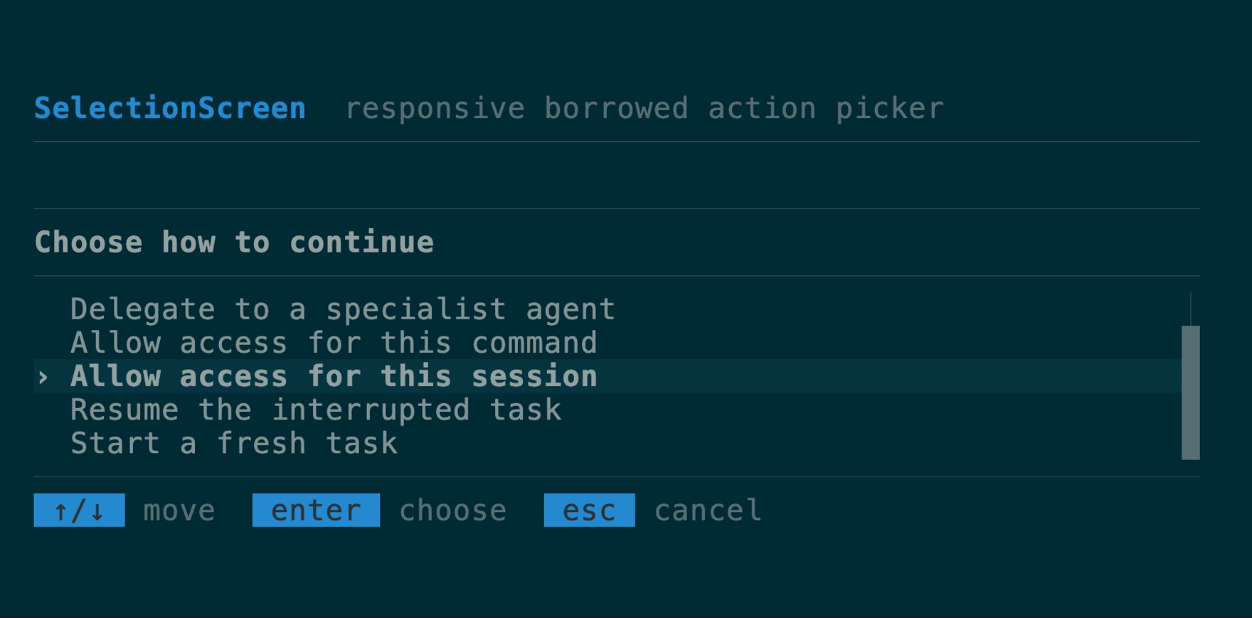
SelectionScreen
A responsive full-screen picker for the repeated action, agent, permission,
and resume shape: optional leading rule, heading-styled header, separator,
selectable body, optional trailing rule, and a KeyHints footer. It composes
Flex, the same row renderer as SelectList, SelectState, and semantic
theme roles. The body automatically windows to its allocated height, keeping
the current selection visible on short terminals. borrowed reuses a host row
slice without cloning; windowed accepts only a host-supplied VirtualWindow;
new owns rows. Header and footer builders accept custom
owned or frame-borrowed views, and per-instance header/selection styles remain
available without embedding an application palette.
API
use tuika::prelude::*;

let screen = SelectionScreen::borrowed("Select an action", &rows, &state)
    .leading_rule()
    .trailing_rule()
    .footer(KeyHints::from_keymap(&keymap));
The runnable action-picker example
borrows the row slice and derives virtualization from the allocated body height.
For general application layouts with sidebars or multiple growing panes, use
Flex and view!.
Flex
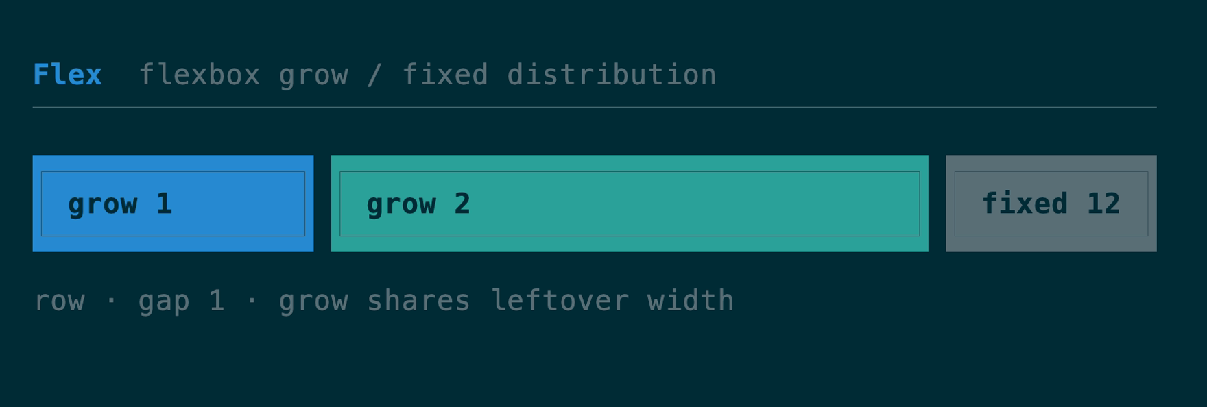
The flexbox container and composition primitive — grow(n) children share
leftover space by weight, fixed(n) reserve exact size, with gap and
padding. It is the view! DSL’s row/col. element and view! preserve
frame borrows through nested Flex and Boxed containers as ScopedElement<'_>;
owned trees continue to use Element without lifetime annotations.
API
use tuika::prelude::*;
view! {
    row(gap = 1) {
        grow(1) { node(left) }
        fixed(12) { node(right) }
    }
}
Need the child rects before (or without) painting — to size a scroll region
to a pane’s real height, hit-test a click, or decide what fits? Flex::solve
runs the same measure-then-solve pass render uses and returns one Rect per
child, painting nothing. Padded containers measure children against the inner
box, and a Flex measured as an Auto child honors its own fixed and percent
dimensions. The underlying flexbox solver is also callable directly as
tuika::layout::solve(area, &style, &items) for layouts built without a Flex.
use tuika::prelude::*;
use tuika::ui::Rect;

let flex = Flex::row()
    .fixed(8, element(Text::raw("sidebar")))
    .grow(1, element(Text::raw("content")));
let theme = Theme::default();
let ctx = RenderCtx::new(&theme);
let rects = flex.solve(Rect::new(0, 0, 40, 10), &ctx); // [sidebar_rect, content_rect]
FlexItemStyle separates child-owned basis/grow/shrink/min/max/align_self
from container-owned direction, wrapping, gaps, justification, and line
alignment. Flex::wrap(FlexWrap::Wrap) forms flex lines; positive and negative
free space are distributed by weight with exact cell-boundary rounding.
Flow
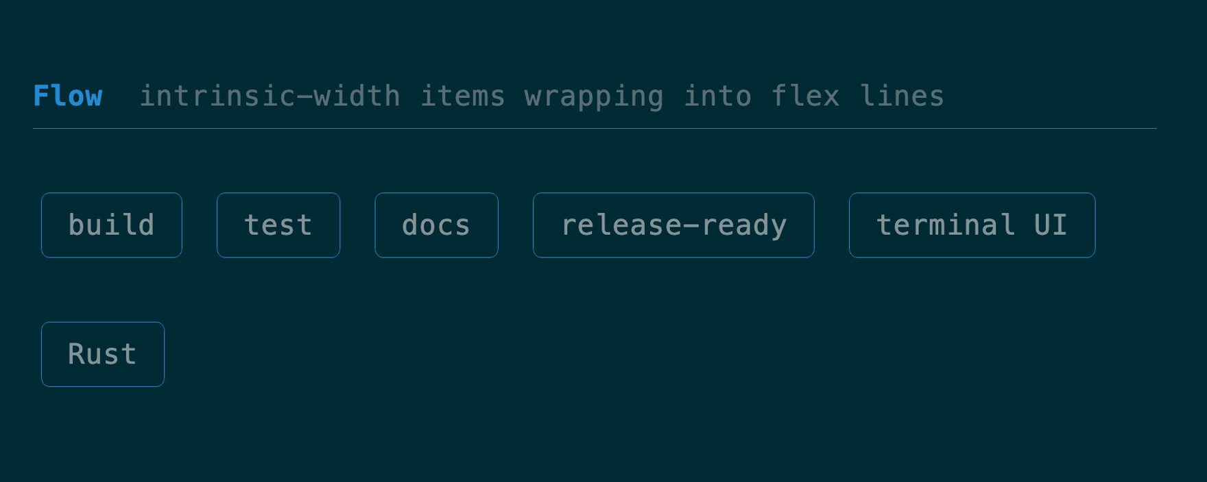
A row-oriented wrapping flex container for tags, actions, and other items whose intrinsic widths decide the line breaks. API
use tuika::prelude::*;
let flow = Flow::new()
    .gap(1)
    .item(element(Text::raw("build")))
    .item(element(Text::raw("release-ready")));
Grid
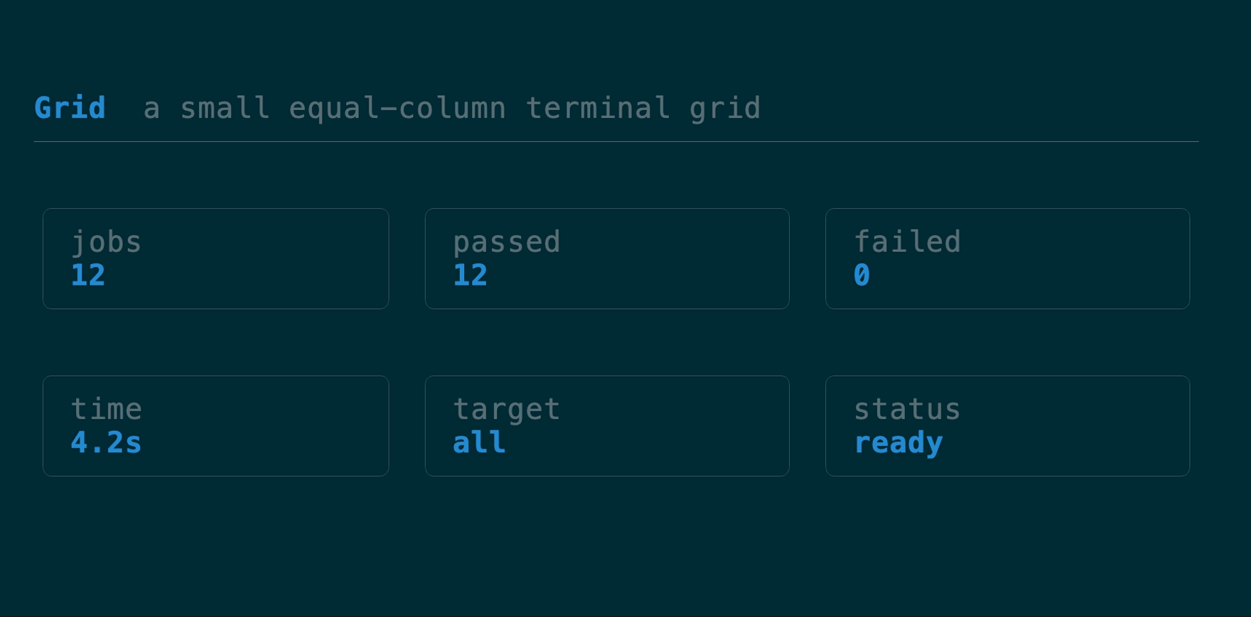
A deliberately small equal-column, row-major terminal grid with intrinsic row heights, independent gaps, padding, and exact boundary rounding. It omits CSS Grid’s named lines, implicit tracks, spanning, and dense packing. API
use tuika::prelude::*;
let grid = Grid::new(3)
    .gap(1)
    .cell(element(Text::raw("one")))
    .cell(element(Text::raw("two")));
Boxed
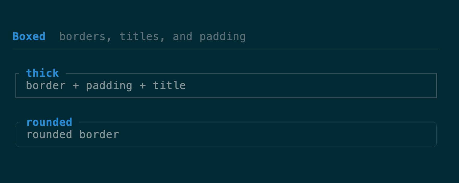
A border + padding + title wrapping one child. The border color is focus-aware
by default (theme border / border_focused); border_color(Color) overrides
that with an explicit color for semantic frames — an accent or danger modal, or
a per-pane color a host resolves itself. An optional title_bottom rides the
bottom border — the slot for a 1 of 3 position counter, a footer legend, or a
hint. Both titles honor their Line alignment; unset, the top title is
flush-left and the bottom title flush-right. Titles begin one cell after the
corner and truncate before the opposite corner, the same rule a bordered
terminal panel conventionally follows.
The stylesheet’s panel padding participates in measurement and rendering;
.padding(...) on this instance takes precedence.
API
use tuika::prelude::*;
view! {
    boxed(title = " title ", title_bottom = " 1/3 ", border = BorderStyle::Rounded) {
        node(child)
    }
}
FocusScope
A layout-transparent wrapper that renders its subtree with an explicit focus
flag. Focus lives on the render context and paint uses one root context, so a
Flex can’t hand a single child focused = true; wrap each pane in a
FocusScope so the active one’s Boxed border lights up while the others stay
dim — independently of the frame’s root focus.
For click-to-focus panes, register stable ids in FocusRegistry, resolve the
clicked pane through a HitMap, then call focus(id). Unknown ids and requests
made while an overlay owns input are rejected, and the original registration
order remains the Tab/BackTab ring.
API
use tuika::prelude::*;
view! {
    row(gap = 1) {
        grow(1) { node(FocusScope::focused(element(Boxed::new(element(Text::raw("active")))))) }
        grow(1) { node(FocusScope::unfocused(element(Boxed::new(element(Text::raw("idle")))))) }
    }
}

if let Some(pane) = pane_hits.hit(mouse.column, mouse.row) {
    focus.focus(pane);
}
StatusBar
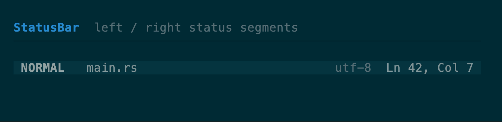
One row with left- and right-anchored segment groups. API
use tuika::prelude::*;
view! {
    node(StatusBar::new().left(left_spans).right(right_spans))
}
Scrollbar + VirtualWindow
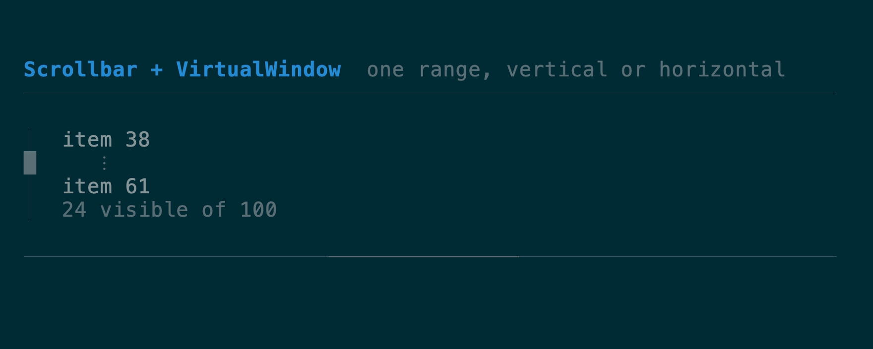
One clamped window model and one scrollbar renderer for vertical or horizontal
collections. VirtualWindow::around keeps an absolute selection visible;
range() lets a host fetch only the current records. SelectList::windowed
and Table::windowed accept that slice directly, preserving absolute selection
and scrollbar geometry without cloning the full collection.
Scrollbar API ·
VirtualWindow API
use tuika::prelude::*;
let window = VirtualWindow::around(total, viewport_rows, state.selected());
let rows = window.range().map(|index| load_row(index)).collect();
view! { node(SelectList::windowed(rows, window, &state)) }