
'%20stroke-width='30'/%3e%3crect%20x='215'%20y='195'%20width='66'%20height='66'%20rx='20'%20fill='%23D4A43A'/%3e%3c/svg%3e)
Themes
Every tuika component styles itself from a Theme
passed through the render context — no component hard-codes a color. Swapping
the theme handed to paint
restyles the whole tree at once.
A Theme is a plain Copy struct of colors, so a palette is just data. tuika
bundles a few standard palettes as full const Theme structures in the
themes module. Reach
one directly, by constructor, or by name:
use tuika::themes;

let a = themes::GRUVBOX_DARK;            // the struct
let b = tuika::Theme::gruvbox_dark();    // named constructor
let c = tuika::themes::by_name("gruvbox-dark").unwrap(); // config / --theme
assert_eq!(a, b);
assert_eq!(a, c);
Iterate themes::PRESETS
to build a picker or validate a --theme value — each entry carries a stable
name, a human label, and the theme itself.
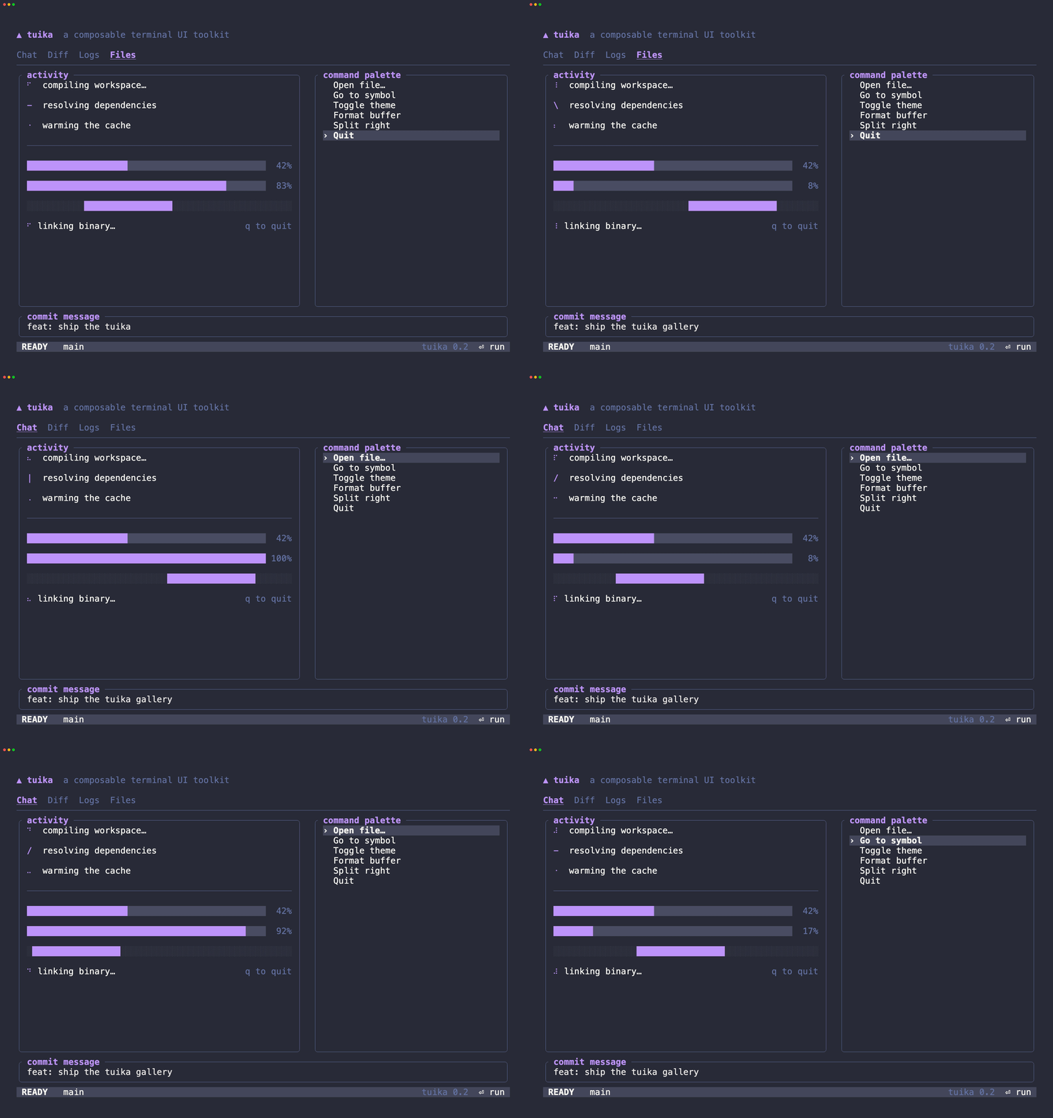
Each demo below is the same animated scene (the component gallery from
examples/screenshot.rs) driven through that one
palette — an honest side-by-side of what a theme does to real components,
recorded the same way as the component gallery:
scripts/gen-theme-demos.sh          # all themes
scripts/gen-theme-demos.sh dracula  # just one
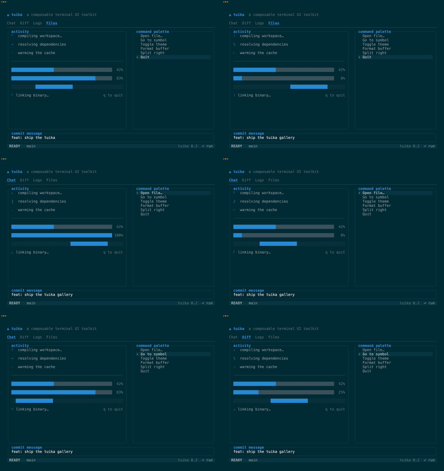
solarized-dark
Ethan Schoonover’s precision palette on the dark base tones. struct
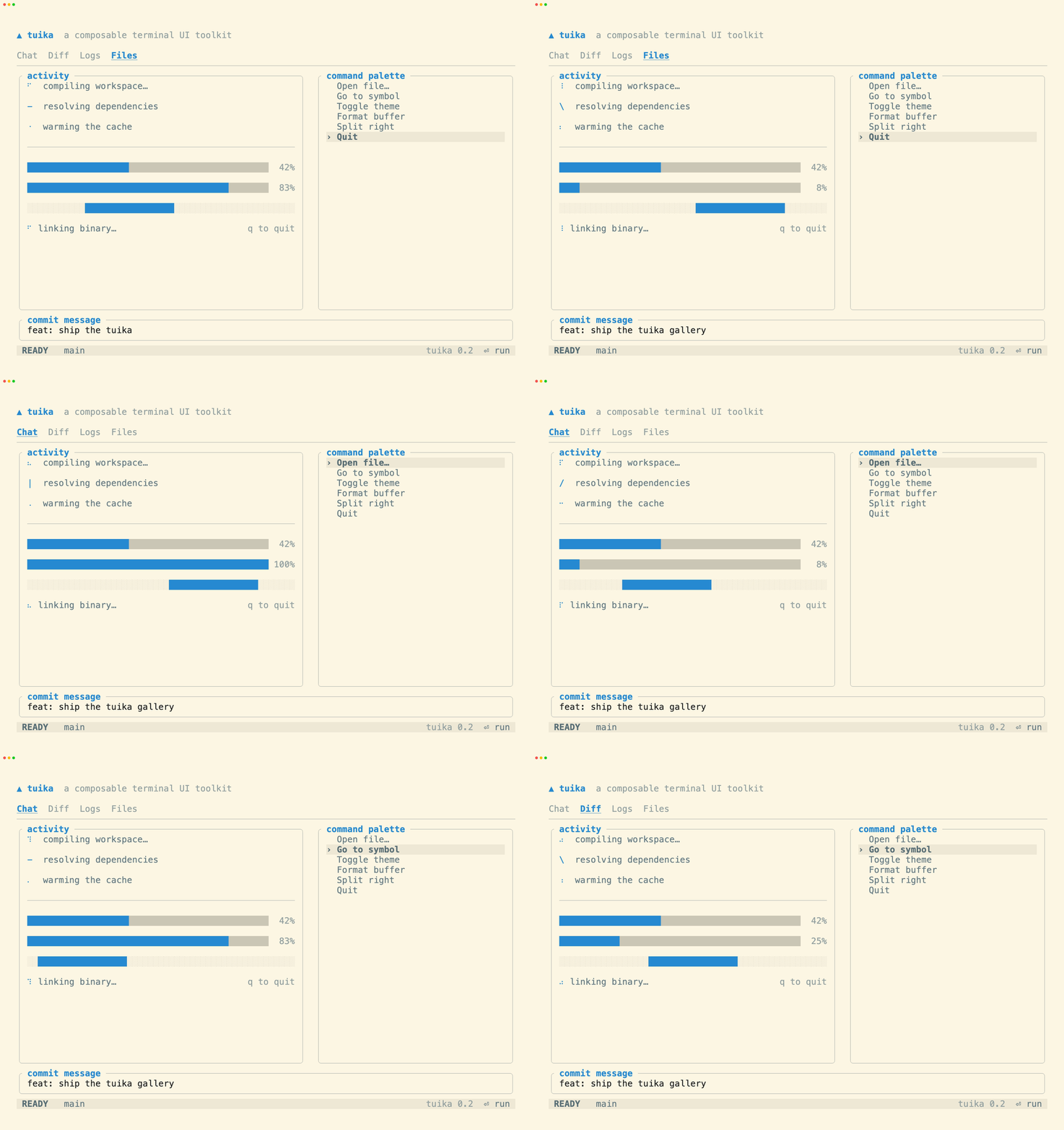
solarized-light
The same accents on Solarized’s light base tones — the light half of the pair. struct
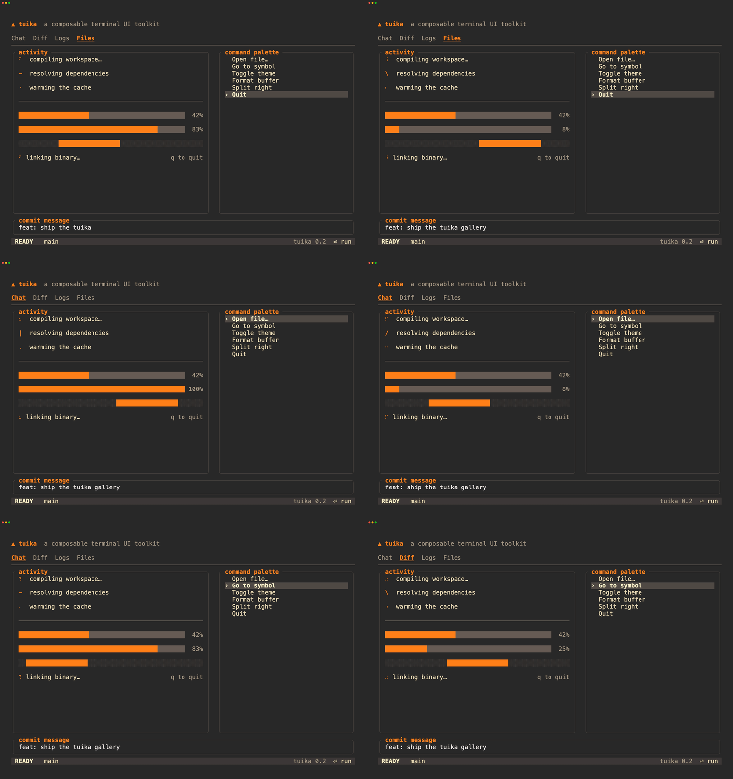
gruvbox-dark
morhetz’s warm, retro-tinted dark palette (medium contrast). struct
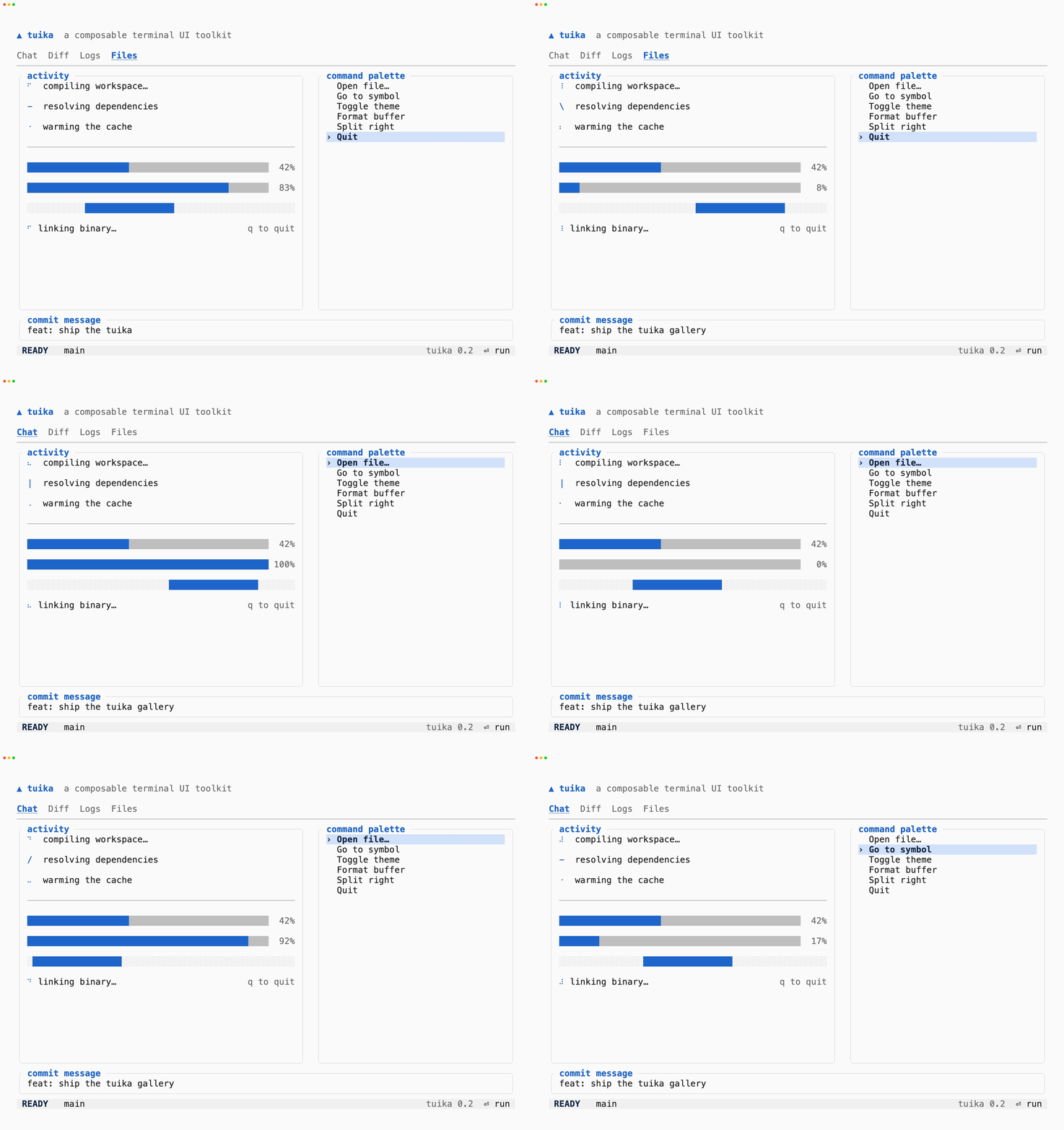
light
A neutral, near-monochrome palette for light terminals — the understated light default, not a brand. struct
dracula
The widely-ported dark theme — purple/pink accents on a slate background. struct
terminal
The one preset with no colors of its own. Every slot is Color::Reset or a
Color::Indexed ANSI slot, so the terminal resolves the palette — the app
adopts whatever the user already configured, with no query and no failure mode.
struct
It has no recording here for the same reason it has no colors: what it looks like is whatever terminal you run it in, so a GIF of it would only ever be a picture of the recorder’s palette. Run it yourself instead:
cargo run --example inheritBecause ANSI has no tone between two slots, the raised and faint roles collapse
(surface reads as the background; dim, border, and muted all land on
bright black). To keep those distinct, ask the terminal for its actual colors and
derive them — Theme::from_terminal — which is covered in
terminal features.
Rolling your own
The bundled palettes are a starting point, not a ceiling. Construct a Theme
literal (or clone a preset and tweak a few slots) and every component follows —
that is exactly how yolop builds its own look on top of tuika.
use tuika::{Theme, themes};

let mine = Theme {
    accent: tuika::ui::Color::Rgb(45, 91, 158),
    ..themes::GRUVBOX_DARK
};
Semantic status styles
Every theme also exposes success_style, warning_style, danger_style, and
info_style (or semantic_style(SemanticRole)). These derive from the
theme’s existing syntax palette, so custom Theme struct literals remain
source-compatible and automatically get status colors:
use tuika::prelude::{SemanticRole, Theme};

let theme = Theme::default();
let error = theme.danger_style();
let notice = theme.semantic_style(SemanticRole::Info);
See also
themesAPI — the presets, theNamedThemecatalog, andby_name.- component gallery — the components these palettes style.
- README — the model behind the toolkit.