
'%20stroke-width='30'/%3e%3crect%20x='215'%20y='195'%20width='66'%20height='66'%20rx='20'%20fill='%23D4A43A'/%3e%3c/svg%3e)
Styling
tuika splits how a UI looks into two layers:
- a
Theme— a flat set of named colors (background,accent,border, the markdown/code palette, …). Every component pulls from the theme; none hard-codes a color. This is the token layer, and it already existed — see themes. - a
StyleSheet— a mapping from a semantic role (a heading, a link, an inline-code span, a toast severity, a diff row, a key hint, …) onto aStyleBundle: the color and text attributes that role draws with. This is the rule layer, and it is what lets you restyle by meaning, in one place, without touching component code.
Swapping the sheet handed to a render restyles every element that role touches at once — here the same markdown block and panels, painted under three different stylesheets:
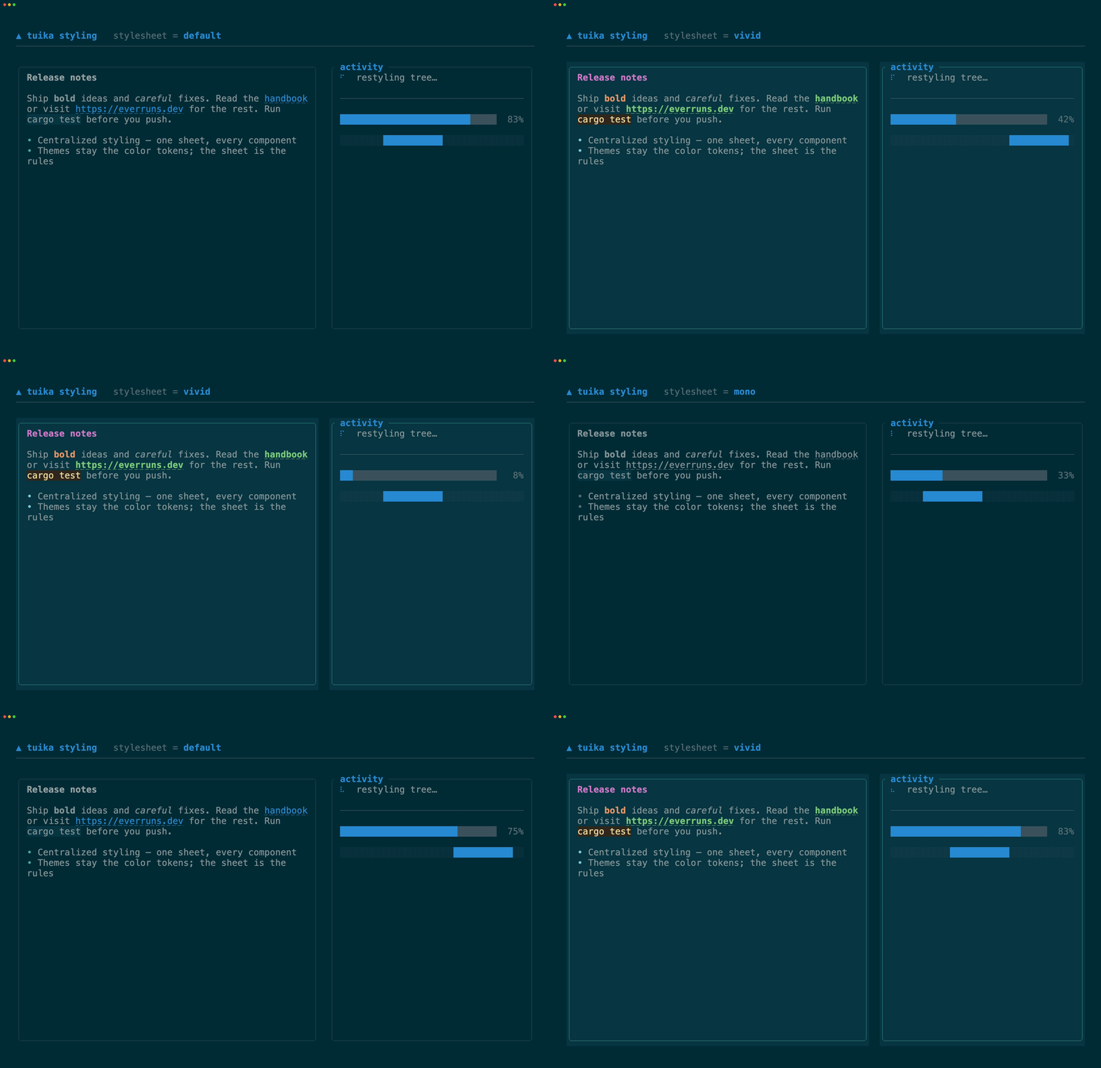
Theme vs. stylesheet
Think CSS: the Theme is your custom properties (--accent, --border), and the
StyleSheet is the rules that map elements to them. The default sheet for a theme
reproduces exactly what components looked like before stylesheets existed, so
adopting it changes nothing until you override a role:
use tuika::prelude::*;

let theme = Theme::default();
let sheet = StyleSheet::from_theme(&theme); // a no-op: today's look, as data
Override a role with struct-update syntax — everything you don’t name keeps tracking the theme:
use tuika::prelude::*;
use tuika::ui::Color;

let theme = Theme::default();
let sheet = StyleSheet {
    // green, bold links (and bare URLs) instead of the default
    link: StyleBundle::new().fg(Color::Green).bold().underlined(),
    // a magenta heading
    heading: StyleBundle::new().fg(Color::Rgb(210, 120, 200)).bold(),
    ..StyleSheet::from_theme(&theme)
};
A StyleBundle is partial: it overlays only the attributes it sets. A
color-less bundle (like the default emphasis rule, which just adds italic) keeps
the surrounding text’s color and only contributes its modifier.
Installing a stylesheet
A host sets one policy for the whole tree. Either paint with it directly:
use tuika::prelude::*;

let theme = Theme::default();
let sheet = StyleSheet::from_theme(&theme);
// paint_with_sheet(buffer, area, &theme, sheet, root, &[]);
or, if you build your own RenderCtx, install it there with .with_sheet(sheet).
Plain paint and RenderCtx::new(theme) keep using the theme’s default sheet, so
nothing else has to change.
Extending the role vocabulary
StyleSheet has typed fields for tuika’s built-in components. A companion crate
or application can add namespaced StyleRole constants without tuika having to
know about them, then supply one StyleResolver for the tree:
use tuika::prelude::*;

const METRIC_WARNING: StyleRole = StyleRole::new("my-app.metric.warning");

struct AppStyles;

impl StyleResolver for AppStyles {
    fn resolve(&self, role: StyleRole) -> Option<StyleBundle> {
        match role {
            METRIC_WARNING => Some(StyleBundle::new().fg(Color::Yellow).bold()),
            // A partial built-in override inherits the sheet's key-cap background.
            StyleRole::KEY_HINT_KEY => Some(StyleBundle::new().fg(Color::Black)),
            _ => None,
        }
    }
}

let theme = Theme::default();
let styles = AppStyles;
let ctx = RenderCtx::new(&theme).with_style_resolver(&styles);
// paint_with_context(buffer, area, &ctx, root, &[]);
Inside a custom View, ctx.style(METRIC_WARNING) resolves application and
built-in roles uniformly. Resolver bundles overlay the active sheet rather than
replace it. If a resolver’s answers can change while the same object remains
installed, increment StyleResolver::revision; measurement caches include that
revision.
The built-in open roles cover toast base/severities, diff base/rows/gutter/
divider, and key-hint keys/labels. Their StyleSheet fields are the ordinary,
data-only path for most hosts. Explicit component overrides remain the narrowest
layer: for example, Diff::style wins over semantic diff-row colors for that one
view.
Styling markdown — headings, links, and URLs
Markdown is fully role-driven. Every part below resolves its style from the sheet,
so one rule restyles it everywhere it appears — a bracketed [link](url) and a
bare https://… URL share the same link role, so restyling links restyles
both:
| Markdown part | Role |
|---|---|
# Heading |
heading |
[text](url) and bare https://… |
link |
`inline code` |
inline_code |
*emphasis* |
emphasis |
**strong** |
strong |
~~strikethrough~~ |
strikethrough |
- / 1. bullets |
list_marker |
- [ ] task boxes |
task_marker |
--- rules |
rule |
 placeholder marker |
image_marker |
The one-shot and streaming renderers both take the sheet:
use tuika::components::markdown::to_lines;
use tuika::prelude::*;
use tuika::ui::Color;

let theme = Theme::default();
let sheet = StyleSheet {
    link: StyleBundle::new().fg(Color::Green).bold(),
    ..StyleSheet::from_theme(&theme)
};
let lines = to_lines(
    "See the [docs](https://tuika.dev) or https://everruns.dev",
    60,
    &theme,
    &sheet,
    CodeHighlighter::Plain,
);
// both "docs" and the bare URL now render green + bold
MarkdownState (the streaming renderer) caches per (theme, sheet) and rebuilds
when either changes, so live restyling is safe.
Styling panels
Boxed resolves the panel role. Its default sets nothing, so a plain box keeps
its theme border and no fill; set panel.bg to give every panel a shared
surface fill, and panel.fg to recolor unfocused borders — without a per-call
.background(..):
use tuika::prelude::*;

let theme = Theme::default();
let sheet = StyleSheet {
    panel: StyleBundle::new()
        .fg(theme.accent_alt)
        .bg(theme.surface)
        .padding(Padding::all(2)),
    ..StyleSheet::from_theme(&theme)
};
Measurement and rendering receive the same context, so the panel role’s padding
changes both the size a Boxed requests and the inner rectangle it paints.
Boxed::padding is the local override when one panel needs different spacing.
Whether a border exists remains instance-level (Boxed::border); color and
text modifiers remain ordinary paint-time rules.
Side by side
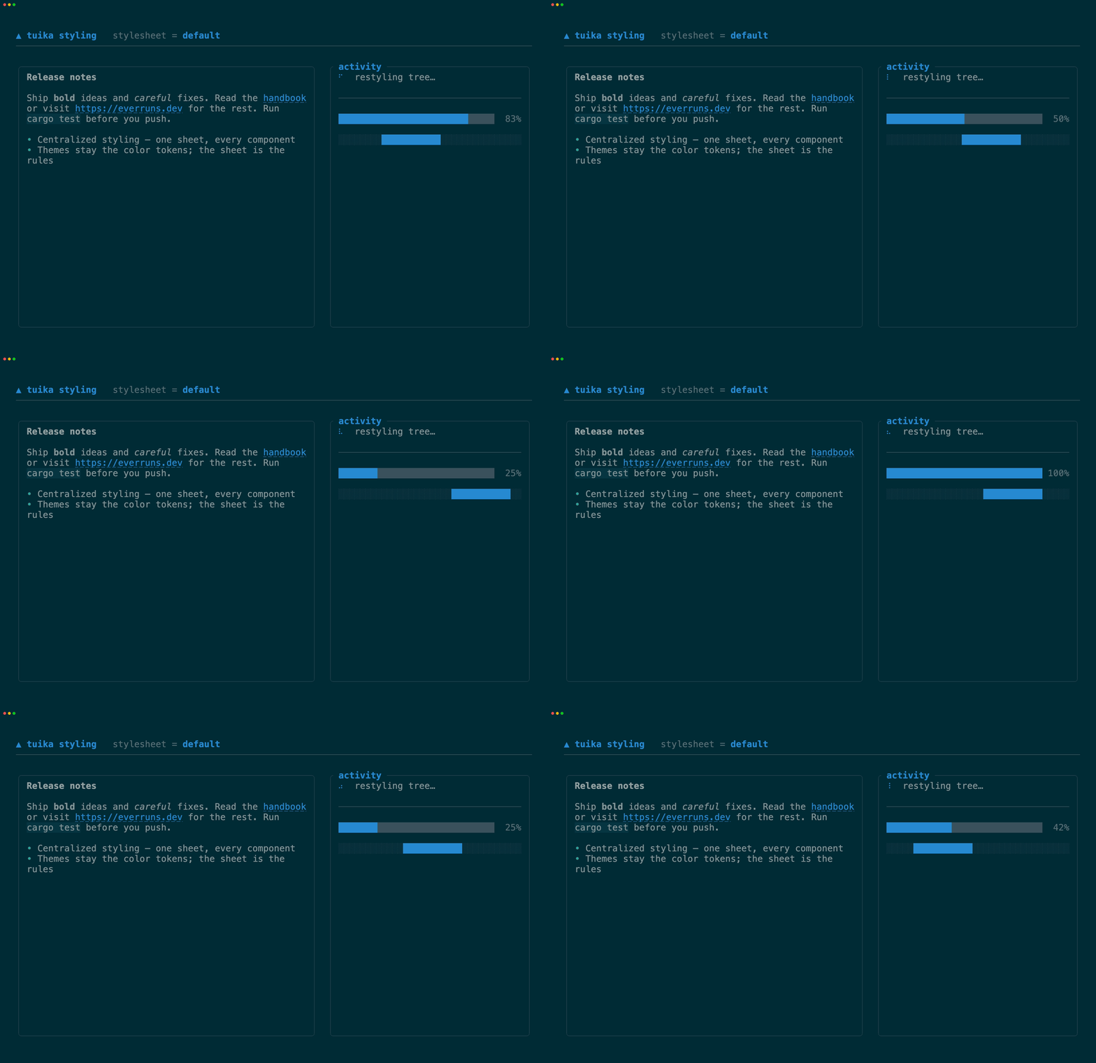
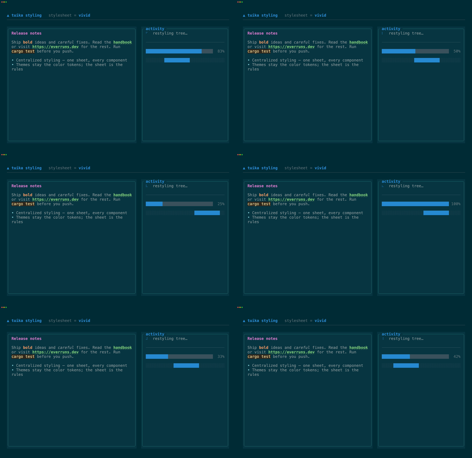
The three sheets above, held still:
| default | vivid | mono |
|---|---|---|
 |
 |
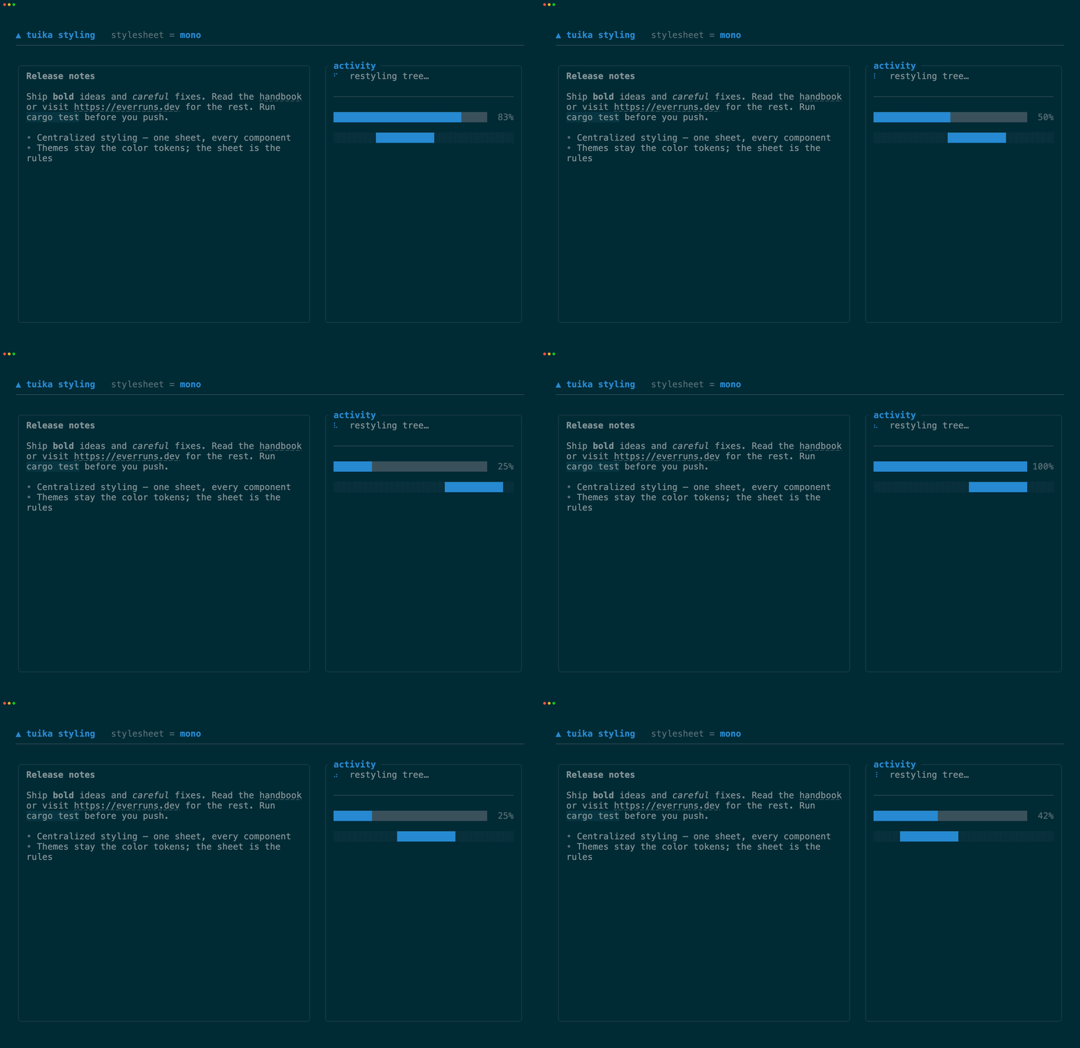 |
Each is the examples/styling.rs scene under
a different StyleSheet; see its variants() for the exact rules.
Regenerating the demos
The GIFs are recorded from the styling example with
VHS (needs ttyd and ffmpeg on PATH):
scripts/gen-styling-demos.sh          # all variants
scripts/gen-styling-demos.sh vivid    # just one
To preview a variant live in your own terminal:
cargo run --example styling                 # cycle the sheets
cargo run --example styling -- run vivid    # hold one
cargo run --example styling -- --theme light # cycle under another palette